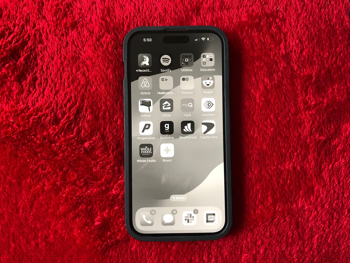
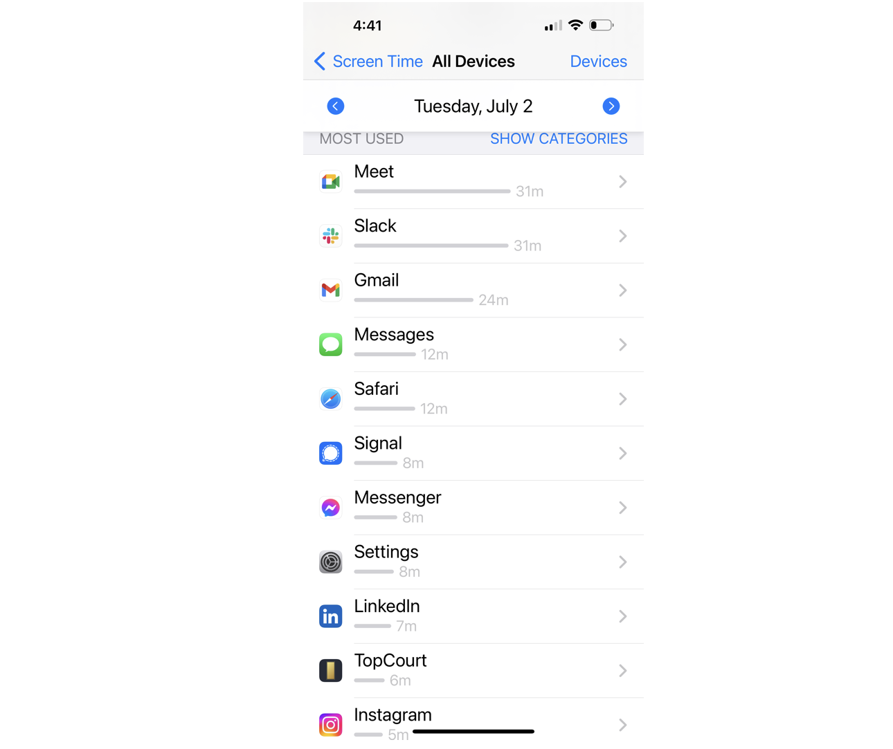
I put all my devices in greyscale mode. Here's what it says about your product.

I have always considered myself a highly productive person. I get my shit done, no matter what it takes. Whether it was pulling all-nighters and sleeping in the library in college, or prioritising all my commitments accordingly - I have grown to be a very reliable person both in my professional and personal life.
However, early this year I had found myself juggling one too many tasks, getting pulled in too many directions and trying to please too many people. I had so much on my plate that I didn't know where to start. My browser had 90 tabs open (not kidding), and I was jumping from one thing to another, getting distracted by the second. In the small gaps I had between my calls, I was relaxing by pulling out Instagram and mindlessly scrolling. Nothing I tried was helping me, until...
I put my computer in greyscale mode.
As soon as I did this, it felt like everything around me just went silent. Almost immediately, I found the urge to switch between tabs a lot less attractive, and proceeded to have the most productive day. I got more stuff done that day than the previous couple days combined.
I quickly set my phone to greyscale as well, and never looked back. Just last week tried it on my TV too. (the TV might be pushing it, but I am never turning it off from my phone and laptop)
What does your product look like in greyscale?
As a TPM, I started QAing all applications still in greyscale. I was surprised to find out for just how few things I actually needed color to get around.
If I don't need any color to get around an application, then what do I need it for (besides staying addicted to my phone)?
This put a whole new perspective on the importance and role of colors inside mobile and web applications. I have worked with many UX designers, and the whole field of color psychology is fascinating: how colors can affect your emotions and guide you through the application.
But why do I need to feel a certain way when clicking a button? And if a UX flow/UI is well done - I shouldn't need color to be able to use it.
Focus on the actual UX and user flow first
Color can truly make or break your application. If an application looks great in greyscale - and you add neon and abstract colors to it - it will probably become too off-putting for users to use. But if an application is unusable without color - then you need to go back to the drawing board. The best applications I tested were the ones that were incredibly easy to use without any sort of color.
Some colors are truly helpful, others are there for decoration
There were a handful of times during QAing when colors would have been helpful. For example, when filling out a form and submitting it with a missing field. Having the in-line error pop-up in bright red is incredibly helpful. Same goes for buttons that delete something important. Other things, like the menu bar or animations on a page, were far less important and color made no difference to them.
Picking out the right contrast
A couple of times I had to turn off greyscale in order to check a designer's work - and oh.my.gosh! The contrast in almost every application was truly blinding. No surprise that I had so much eye strain every day. Color adds such an unnecessary and unnatural workload for your brain.
But in today's world where companies are fighting to get your attention - the principle to design digital products in the most addictive way possible through color just doesn't sit well with me. Greyscale has allowed me to focus on the applications that truly provide value to my life, rather than trick my brain into using them. Because once you strip down the colors, you can see the true colors of every application.
The Science behind greyscale
This approach is scientifically proven - colors are neuron-stimulating, and removing them makes you less excited about clicking on an icon.
Colors don't help us detect objects - but rather help us understand what might be important and what needs our attention. It's a primal need that keeps you in an alerted state - and when there is a lot of contrast and colors, your brain is constantly tricked into feeling the need to look or click on it.
This explains why many people (including myself) land inside Instagram, when they originally opened their phone to check their email - the icon was bright and "oh so more attractive."

Big companies like Meta and Google know this very well, and they spend millions on applied neuroscience research to understand exactly how color affect humans... and how they can use this to make you more addicted.
“If you had a color palette, you would end up with a phone that looked pleasant and was not addictively rewarding, that had some intentionality, but of course nobody wants you to do that, because what they want is for you to look.” (Bevil Conway, an investigator at the National Eye Institute)
Other ways how greyscale changed my life
Besides noticing just how greyscale impacts products, it was just as exciting to observe how my behavior was changing.
Social media and video-based content became less interesting
Putting your devices into greyscale doesn't mean you will never open a social media app again. But I promise you that your usage will plummet significantly. You might still want to catch up with people's updates, and you might watch a couple of videos - but without the colors, you will lose interest much quicker and eventually close the app.

Text-based medium usage increased
Now I am not spending as much time watching videos or looking at photos - and spending more time on text-based platforms. Think X, Reddit, LinkedIn. I have been reading a lot more on my phone, and think this was such an incredible added benefit.
My deep work time increased
"Deep work" is a term coined by Cal Newport - an associate professor of computer science at Georgetown University and author of Deep Work: Rules for Focused Success in a Distracted World.
Ever since I turned greyscale on - I have been able to focus deeper for longer, and this has been transformational both in my personal and professional life. It's an incredible feeling knowing that I am in control of my time, and not wasting it on meaningless scrolling.
Eye strain disappeared
Before greyscale, my eyes felt strained on the daily, no matter how little I was using my computer and phone. One of the best side effects has been my eyes feeling a lot more relaxed. Now I need to work on a device for 12+ hours at a time to feel tired from it. Give it a try!
How to enable greyscale on iPhone
If you made it thus far, thank you. And I am assuming you would like to give greyscale a chance. Below you can find an animation on how to do that - may I warn you that it feels a little weird at the beginning. Just give it an hour and you will thank me later 😸