3 things Thrive Market did well upon launch

At this point, if you have some interest in the natural food space - and especially so if you also are a mom from the Midwest - you must have heard about Thrive Market. If not, let me bring you up to speed: imagine the online version of Costco for healthy foods. That's right, you pay a yearly membership to get Whole Foods-style foods for 30% off the retail price. Now that's a deal.
Thrive Market had already raised $8M upon launch (after being rejected many times, but that's a different story) and this allowed them to launch a really great product early on. Don't get me wrong - their platform or service wasn't perfect, which was one of the reasons I cancelled my membership back then. It was pretty limited in scope, while also achieving its main goal. But it was still above and beyond a true MVP that bootstrapped/pre-funding companies can afford. Nonetheless, there is plenty we can learn from their early release.
My Thrive Market journey
I have been a fan of Thrive Market ever since it launched in 2014. I happened to be really involved and active in the natural health communities back then, so I learned about it early on. This gave me the opportunity to follow and see a startup grow before anyone else knew about it.
Many people who visit Thrive Market's website today would think this is what it has always looked like, and that the company miraculously thrived (pun intended), but the reality is that it went through many hurdles, and also many design iterations before landing on today's version. When I started college in September 2015, the first thing I did to celebrate my semi-adulthood was order a box of Thrive Market goodies - I know, very unorthodox. Sadly, it took boxes over 2 weeks to arrive in upstate NY, and also paying for a yearly membership for groceries didn't make much sense when I had a huge college meal plan. So I cried while cancelling my membership (jk, I didn't cry) and hung up a Thrive Market sticker on my wall as a reminder of how cool this company was.
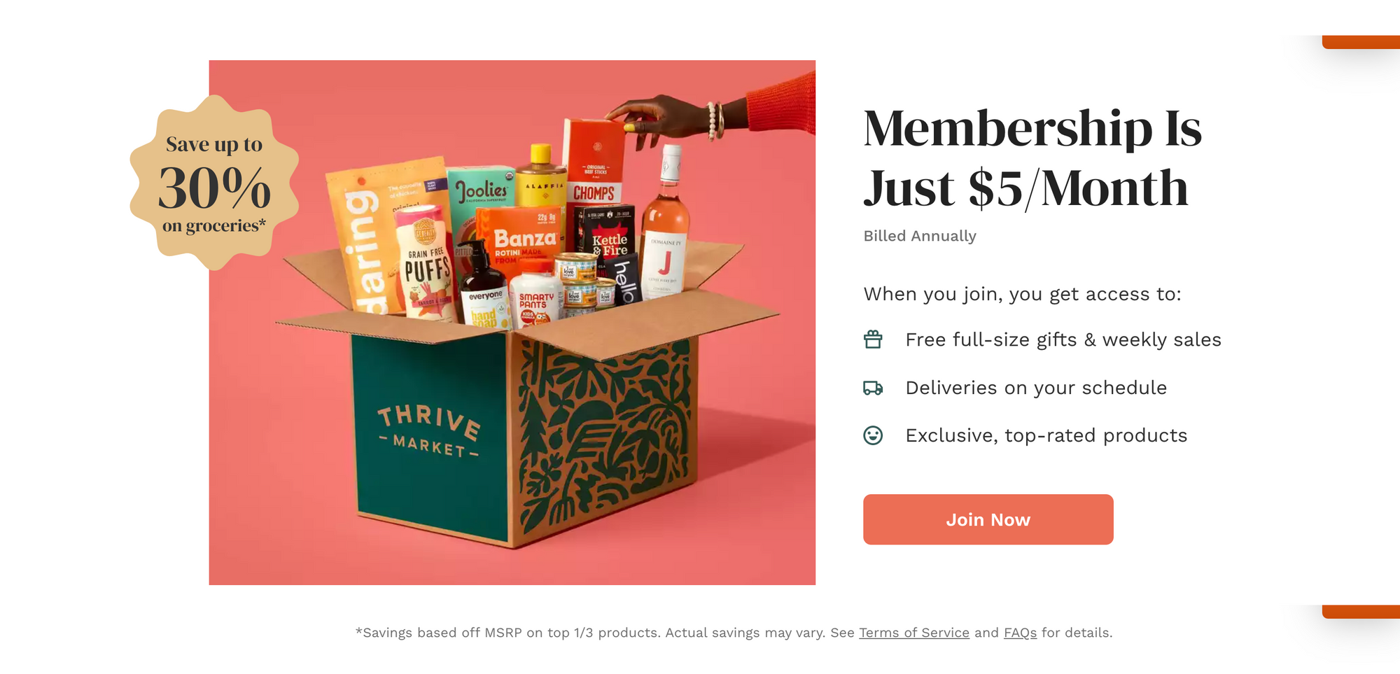
Today, surprisingly some things haven't really changed - like the annual price. I remember their price was $59.95 for an annual membership - pretty much the equivalent of their $5/month ($60) today. I guess despite inflation, scaling drastically helped them lower their margins to a point where they could keep the same price and make more profits.
The good stuff
3 things they implemented early on that (probably) made a difference
I love Thrive Market's web platform and there is a lot to point out in regards to the design and flows they implemented, but I will keep it concise with three things that I think they did well early on.
1. Priority #1: Capture the email
Thrive Market's landing page went through many iterations over the years, but one thing stayed the same: capturing new users' emails as quickly and as easily as possible. That's one of the golden rules when launching a new product. Hold onto any users who might show even the slightest interest in your product. Make it easy, almost impulsive, for them to share a valuable piece of contact information.
In the images below, you will see that their earlier iterations of the landing page included a CTA (Call-to-action) to start, but it didn't include the email field. So a user might click on the button out of curiosity, and then drop out - in which case you can't follow up and remind them to continue. I guess Thrive Market realized this, and decided to include the email field in order to build up their customer list.
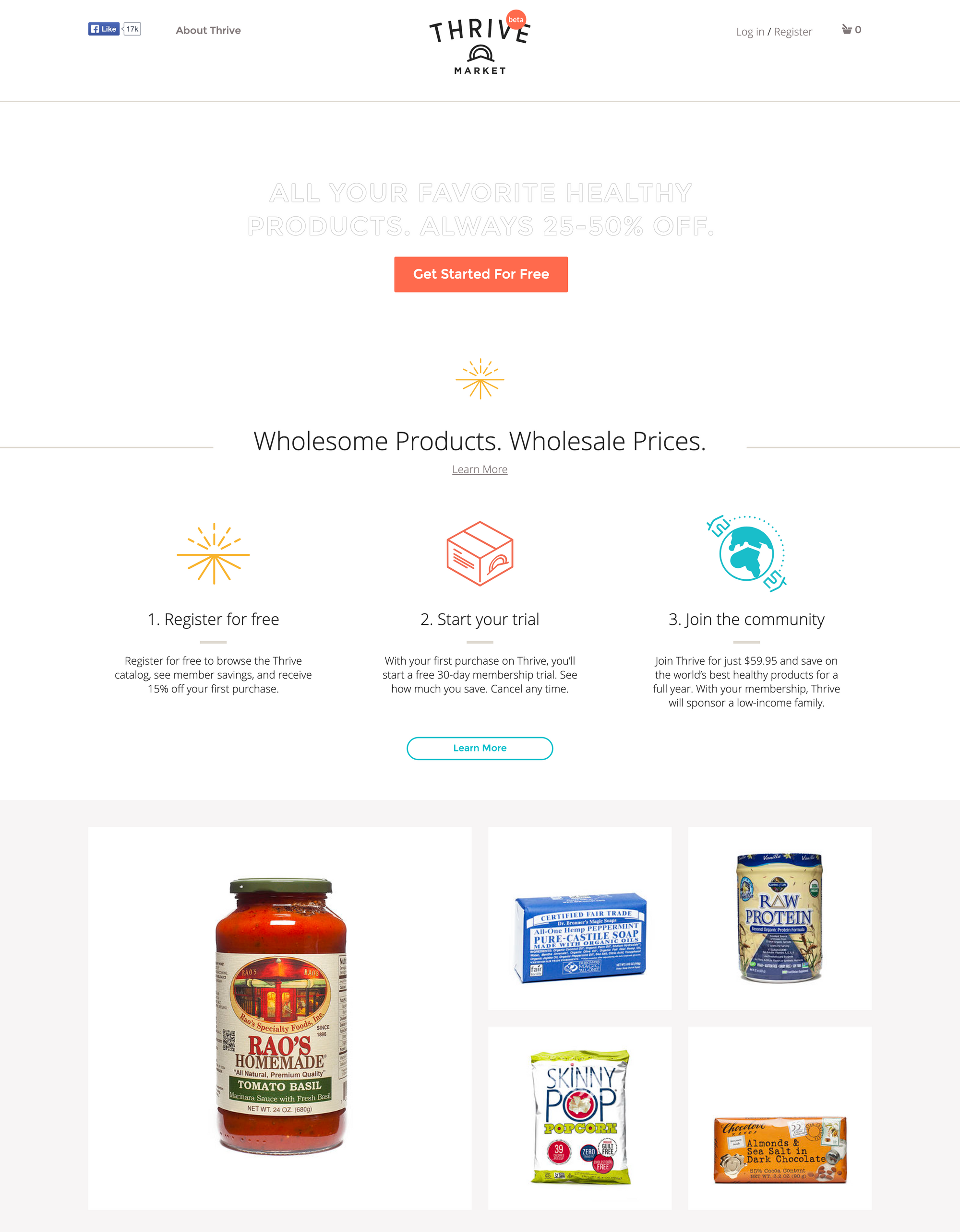
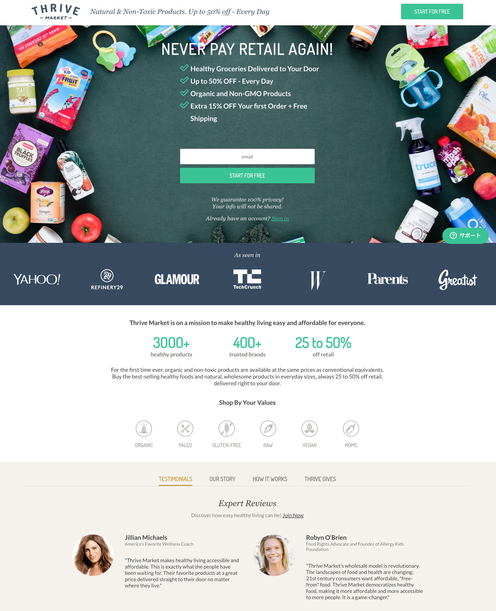
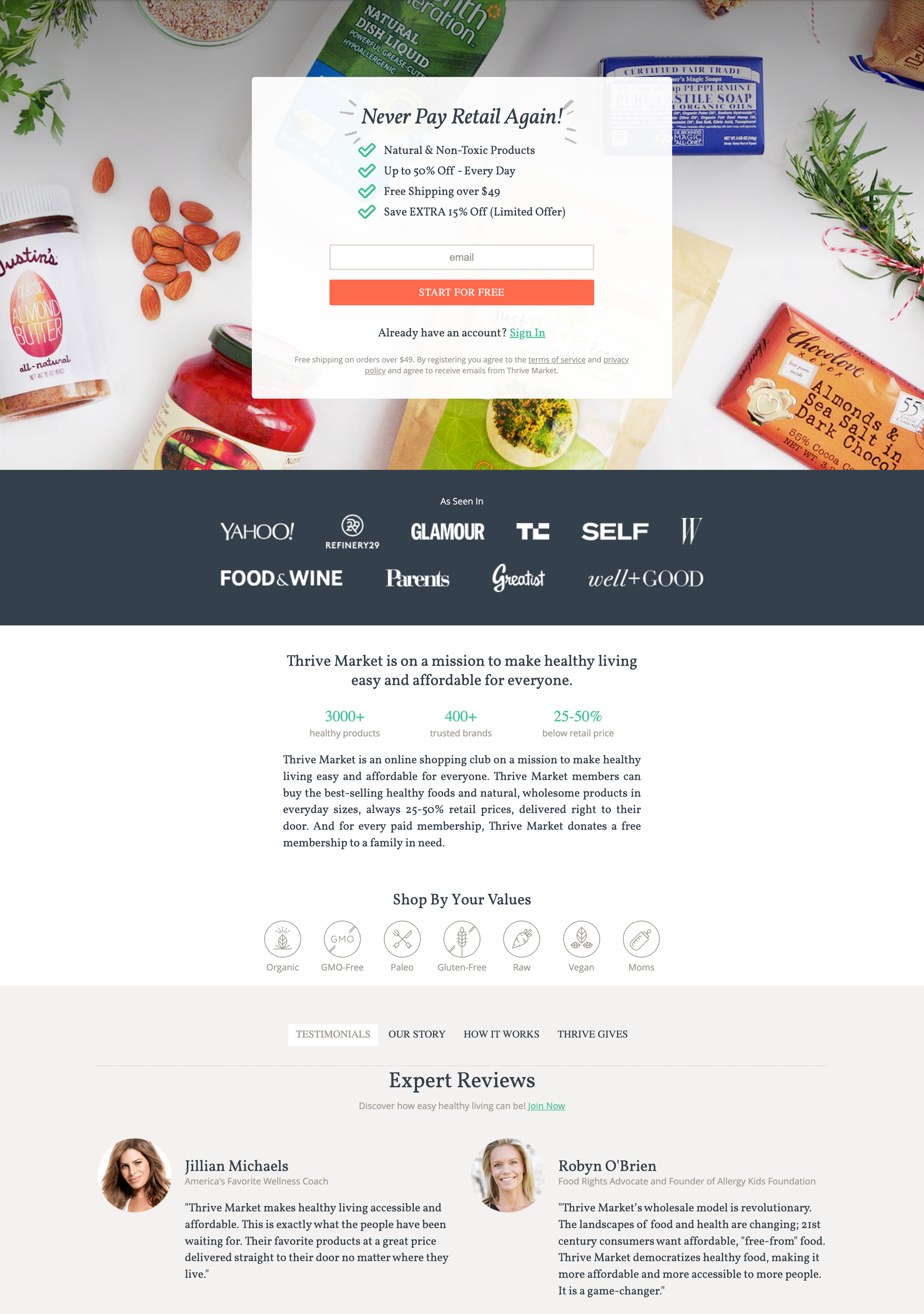
I always think this goes without saying, but I see founders falling for convoluted and long sign up flows over and over again. I get it - you want to collect as much information as possible, but you don't have to do this at the beginning. You can gradually collect more and more through emails, the checkout process and surveys.
(*their sign up model has evolved beyond capturing email early since then - they require a subscription before browsing, ask for a survey etc. - which is something they can now afford as a more mature and trusted company.)
2. Automated Emails
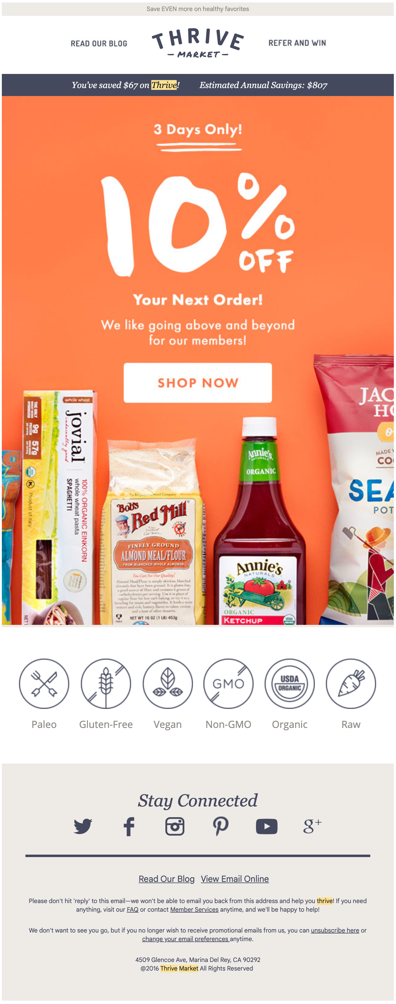
One of the things the company has always done well from the beginning is having a very robust automated email system:
- Thanks for Joining!
- Oops, you forgot something (whenever I left things in the cart)
- Back in Stock!
- New order, Order shipped, Order delivered
- Membership trial expires soon, Membership expired
- Recipes and educational articles
I really believe that having good-looking, professional and engaging emails is a very important factor when launching a new product - it gives your users more confidence, while also not letting them forget about you. (SMS messages might be even more exciting, but that's a topic for another day). You don't need to create 100 automated emails, but the few you do create - make them look nice.
Creating emails and integrating them is very time-consuming, and sometimes requires the engineering team to integrate them which can cost money and time. Let's not forget that Thrive Market raised $8M before they launched, so what they delivered is not a realistic scenario for bootstrapped companies early on. Nevertheless, it's important to look at what now-successful companies did at the beginning in order to learn what their priorities looked like.
If you are looking to do some emails yourself, Mailchimp is a good service to look into. Their transactional (through the code) emails are expensive, but their platform is very easy and fun to use, and you can set up some sequence emails with ease for cheap. When Thrive Market started, they used SAILTHRU, and judging off their emails, the service seems to be solid (they are media and retail/ecommerce focused). Setting it up requires a demo however, meaning that their prices might be a bit prohibitive. Sendgrid and Mailgun are other cheaper alternatives worth mentioning. In some cases, it makes sense to hire a marketing expert to create those emails for you in order to make them look attractive.


3. Attractive Pricing and Perception
Like I mentioned, Thrive Market hasn't changed their baseline membership price which is incredible given the recent price hikes everywhere. In fact, you might be getting way more for your buck than before through all the free gifts they send. Back in 2015, they didn't offer a monthly plan which was a little disappointing, but understandable for a startup that just launched. They have remedied this since then, and today you are able to purchase a monthly plan for $12/month, bringing the annual price to $144. Either way, depending on your purchase, you might be able to make up for the membership price with your first order making it an incredibly good deal. Many founders choose a price that is completely out of touch with their users' willingness to pay - so it's important to experiment and understand what the ideal price should look like, something that I will go over in later posts.
Over the years, Thrive Market played around with how they display their price: early on, they advertised the $59.95/year and free shipping, now they are focusing on the lowest number possible to display. It looks a lot more welcoming to say "$5/month" than the $59.95/year + "free shipping over $49" before.
